NOTICE: All logos shown here are registered trademarks (TM) and the property of the Regional Bell Operating Companies, Lucent, AT&T or Bell Labs. They are shown here for historical/archival purposes only. This web site and the server where these files are stored are not affiliated with any of the above mentioned trademark owners nor do the use of the logos on this web page constitute any commercial or for-profit use. For Bell trademark information, see bell.com

We Offer Personalized One-On-One Service!
Call Us Today at (651) 787-DIAL (3425)


The Creator of the Bell and AT&T Logos
“The [Bass & Yager] design firm had created the famous bell symbol for the nationwide phone monopoly in the late 1960s. This icon–which achieved a remarkable 93 percent recognition rate in the United States –aspired to the simplicity and directness of a sans serif letterform. In 1984, the familiar bell symbol was transferred to the divested “Baby Bells,” and Bass & Yager designed a striated sphere for AT&T, aiming to signify the corporation’s international stature and the ascendance of digital communications.”
—– AT&T
Click HERE to view the history of Saul Bass, and his notable achievements in film and design. Due to the achievements of Saul Bass, including his design of the Bell System Stationery Manual and Graphic Standards Manual and iconic Bell logo in 1968, as well as the 1982 AT&T “death star” logo that would become the post-divestiture identity of AT&T from 1984 onwards.
A book about Saul Bass and his unique designs was published in November of 2011, and is available the the Bell System Memorial site. Simply click on the Amazon link, and you will be taken to the dedicated page for; “Saul Bass: A Life in Film & Design”, authored by his daughter, Jennifer Bass, and Pat Kirkham.
“The design development of the AT&T globe symbol began in late 1982, with the agreement between AT&T, the U.S. Department of Justice, and Federal District Court Judge Harold M. Greene that AT&T would divest itself of the 22 Bell Operating telephone companies as of January 1, 1984. Initially, the globe symbol was shown in conjunction with the logotype “American Bell” to identify an AT&T subsidiary providing terminal equipment and enhanced service on a unregulated basis. Later, Judge Greene ruled that the ‘Bell’ identification must be assigned exclusively to operating companies. Thus, the symbol was joined with the new name and logotype ‘AT&T’ to form the identification signature for the restructured AT&T.
The globe symbol was designed by Saul Bass of Bass/Yager & Associates. Literally dozens of symbol concepts were explored. The concepts were presented to the highest levels of AT&T management along with the design firm’s recommendations as to which concepts should be considered the most promising candidate designs. It was from this group that the globe symbol was chosen to become the keynote graphic identification for AT&T.
The globe symbol symbolizes a world circled by electronic communications. More specifically, the symbol is made up of very carefully delineated ‘highlight’ and ‘shadow’ elements. As a result, the symbol may be reproduced to give the impression of a three-dimensional sphere that is lighted from a distance source.”
From the AT&T Logo History web page (there is a neat Bell logo to AT&T logo animation on that page worth viewing as well).
The AT&T Corporate Signature web page and AT&T Brand Center (which links to the above mentioned History page) contains detailed information about the media applications, appearance, and standards that should be followed for the AT&T logo/name.
The 2010 AT&T Information Servicesphone directories in the AT&T Southeast, (former BellSouth) region, has released their new phone directories with the history of the Bell and Bell logos. Thank you to David Massey for sending us this page.
Bell System logo redesign, by Saul Bass
Click HERE for a 1969 newspaper clipping about the project.
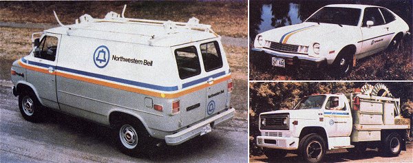
According to AT&T: “the Bell System redesign was the largest corporate re-identity program in the U.S., ever.” The redesign covered 135,000 Bell System vehicles, 22,000 buildings, 1,250,000 phone booths, and 170,000,000 telephone directories.

The new AT&T logo (post divestiture) started out with 24 versions and a complex set of rules for its proper usage. This became a real problem for AT&T to deal with and so in the October 6, 1987 issue of the corporate magazine called “FOCUS”, they published an article that discussed the logo issue with the employees. To view this article click HERE.
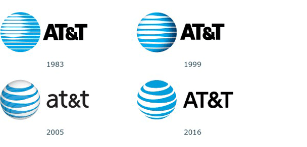
Later, in about 1999, AT&T decided to use a constant eight lines in the logo regardless of the size of the logo in printed form.
In 2005 AT&T merged with SBC to form a “new” AT&T. A short animation of the emergence of the new AT&T logo can be viewed by clicking HERE. The logo history involving SBC and AT&T is shown in two PDF documents released on November 21, 2005 when they unveiled the new logo. You can view these documents by clicking HERE and HERE.

 Bell Logo, 1969
Designer: Saul Bass (19201996)
Firm: Saul Bass & Associates, Inc.
 AT&T Logo, 1984
Designer: Saul Bass (19201996)
Firm: Saul Bass & Associates, Inc.

UPDATE: On November 21, 2005 the new AT&T logo was unveiled:


UPDATE: 2016 a revised AT&T logo was unveiled:
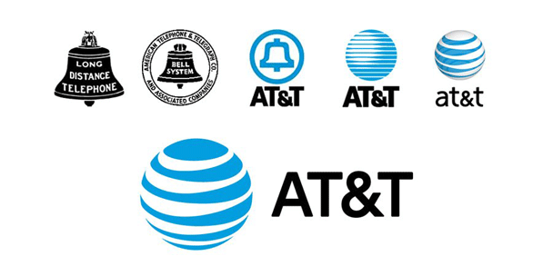

New! As part of our re-design project, we have carefully recreated the Bell Logos in their original format. We have all of the logos that the Bell System used in 1970’s and early 1980’s in the following formats: Adobe Illustrator, Adobe Photoshop and in (.gif). We are working on the other logos, however the Bass & Yager version is the most complete version we have. Simply click on the appropriate logo to zoom in.

Along with the modern-day Bell logo, the Bell System also unveiled the famous yellow/gold (ochre: Red=243 Green=207 Blue=29 or Hex= #F3CF1D) and " process blue" (Red=0 Green=145 Blue=201 or Hex= #0091C9) color stripes in 1969 (similar to what you see at the top of this paragraph.) The stripes appeared on company vehicles, hard hats, etc. What people think is gold is actually “ochre” (their form of yellow/gold) which was developed from a derivative of the old gold that was used in the earlier decals. The blue is also unique and both are still manufactured to the original specs. The blue is a form of process blue.
Click on image above to view entire 3M advertisement (contribute d by John S. Flack)
Scanned from page 24 of the May 24, 1982 issue of “Telephony - International Issue”
Bell was always an innovator, reflective sheeting material was used by them on their original 1939 bell decal and on every vehicle ever since, even through today. It has been reduced to one white reflective stripe on Verizon vehicles.
Click on image above to view entire 3M advertisement (contributed by John S. Flack)
Scanned from page 21 of the May 24, 1982 issue of “Telephony - International Issue”
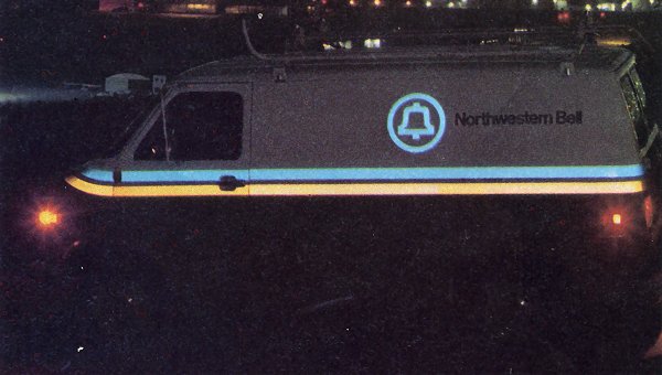
The 1969’s new look was all about visual communication. Blue was to be the new symbol of telecommunications (the future) as well as the change in the Bell logo. The ochre represents a remembrance of the past (notice Blue is atop the ochre) and then there was the gray/green bottom also so the public could recognize the truck as a telephone company vehicle. That color would also carry through to many other company pieces of equipment such as cross boxes, protector housings etc. That was so it would be recognized as telephone company equipment.
By branding all vehicles with the new look was to bring about a friendlier appearance to the company and get away from that military look. Today visual communication has turned to red and black for telecommunications; just look at the many smaller telcos such as Sprint, Cablevision etc.
The above information on the stripes was contributed by John Stallone (ATCA member #3315)
The older Bell System vehicles were painted a military-looking camouflage color. The official color of this Bell System paint was Sherwin Williams “Bell System Green-grey, JX-6047”. Thanks to Tim Fox for this information!
The following article introducing the 1969 change in the Bell Logo and introduction of the blue and yellow stripes appeared in the September/October 1969 Bell Telephone Magazine publication:
“The stylized bell in the circle and the colorful truck below give a thumbnail preview of what is to come for visible parts of the Bell System plant such as cars, trucks, public phones and business offices. Crisp blue and yellow stripes will mark the new design for vehicles, separating the white heat-reflecting top from a grey-green bottom. The revised Bell seal will be used with simple, easier-to-read lettering to identify the various Bell companies and will appear on stationery and phone bills. Because of the nationwide size of the task, the cutover to the new designs and symbols will be gradual, with most changes taking place over a five-year period. Some items must undergo more experiment; some field testing is needed; economic decisions, as distinct from design decisions, must be made. But the paint shops and sign makers already have started to transform the Bell System’s face.”
Click on image above to view high resolution scan of 1969 logo.
Webmaster’s Note: The Bell Telephone System undertook the largest Corporate Identity Program in the United States of America. Project consisted of redesign of 135,000 Bell System fleet vehicles; 22,000 buildings 1,250,000 phone booths; 170,000,000 telephone directories.
With, 1,060,000 employees; 80,000,000 customers. It took five years to implement this program - from 1969-1972 - and without the aid of computers!

A scan is downloadable/viewable of the AT&T logo changes (similar to above but with the additional change in 1984 of AT&T’s logo since the courts prohibited them to use the Bell logo after divestiture.) The original copy I received from AT&T was not of high quality - looked like a copy of a copy of a copy! So there is a lot of distortion in the logo dimensions (some look egg-shaped!). Click HERE to view or download the PDF file or HERE to download the GIF file format.
Another scan of a Bell logo history document dating back to sometime between 1939 and 1963 can be viewed HERE (thanks to Ross Hamilton).

The Bell symbol History
The Chronology
Reference: Bell Atlantic
In Boston, on March 10, 1876, Alexander Graham Bell transmits the first complete message - “Mr. Watson, come here, I want you!” - with the use of his invention, the telephone.
About two years later during the period from July 30, 1878 to April 17, 1880, a series of Massachusetts corporations controlling Mr. Bell’s patent rights are organized. Bell Telephone Co., is the first of the corporations and is soon superseded by National Bell Telephone Co., which is replaced with American Bell Telephone Co. These firms supply telephone instruments to Bell-licensed exchange companies across the country. The Bell-licensed exchange companies then rent the telephone instruments to local subscribers.
Then on March 3, 1885, the American Telephone and Telegraph Co. (now known as AT&T) is established as a subsidiary of American Bell Telephone Co. Because the firm connects remote exchanges, it is popularly called the long-distance company.
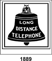
1889 - First Bell logo
Alexander Graham Bell’s original telephone patents expire during the years 1893 and 1894. Many independent telephone companies were formed after the expiration of Bell’s patents and there is fierce competition for the next 20 years.
On December 30, 1899, AT&T succeeds American Bell as the parent of the Bell System. In general, the system’s division of labor is as follows: AT&T provides overall support and direction for the other companies in the Bell System, its Long Lines Department manages long-distance service, Bell Telephone Laboratories (formed in 1925) conducts research and development, Western Electric Co. manufactures communications equipment and the Bell operation companies provide local telephone service.
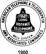
1900 - S econd Bell logo
The Interstate Commerce Commission (ICC) assumes jurisdiction over interstate telephone companies on June 18, 1910.
The U.S. Department of Justice files an antitrust suit against AT&T on July 24, 1913. The complaint charges AT&T with conspiracy to monopolize and restrain trade in the northwestern states of the USA. Then later that year on December 19th, AT&T Vice President Nathan Kingsbury agrees to provide long-distance connection of Bell System lines to independent phone companies in a letter to the U.S. attorney general. He further agrees not to purchase competing independent without prior ICC approval. This letter is commonly known and the “Kingsbury Commitment”. A consent decree ends the antitrust suit against AT&T on March 26, 1914.
The U.S. government runs the telephone system during the only time in American history from July 1, 1918 to June 30, 1919. The postmaster general serves, in effect, was a super-chief executive officer, although Bell System personnel handle daily operation.
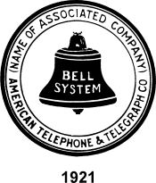
1921 - Third Bell logo
The first broadcast of a football game (University of Chicago v. Princeton) is sent in October of 1922 over telephone wire from Chicago to New York City.
President Franklin D. Roosevelt signs the Communications Act on June 19, 1934. The law places interstate telephone business under the regulation of the newly formed Federal Communications Commission (FCC).
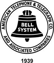
1939 - Fourth Bell logo
The U.S. Department of Justice files suit against AT&T on January 14, 1949, charging that it conspired with Western Electric to monopolize trade in telephone equipment. The lawsuit attempts to separate the Bell System’s manufacturing arm from its research and operating functions.
Over two and one third trillion - 2,300,000,000,000 - telephone calls go through Bell Systems central offices from 1950 to 1975.
A consent decree on January 24, 1956 bars AT&T from engaging in unregulated businesses, brings to a close the Justice Department’s antitrust suit against the company. Western Electric remains AT&T’s largest single subsidiary.
1964 - Fifth Bell logo
The FCC reaches its Carterfone decision on June 26, 1968. Carter Electronics of Dallas sought to interconnect its two-way radios with the nationwide phone system. The ruling strikes down interstate tariffs that prohibit attachment or connection of non-Bell System communications equipment to the public network. And it opens the way for competition in the customer-owned equipment market.
1969 - The sixth and current Bell logo
On August 13, 1969 the FCC approves the application of Microwave Communications, Inc. (MCI) to build a private line microwave communications system between Chicago and St. Louis. The action ultimately stimulates full competition in the long-distance phone business.
In 1971, Illinois Bell introduces Call Waiting, Three-Way Calling, Call Forwarding, and Speed Calling.
The Justice Department files a final antitrust suit against AT&T on November 20, 1974, charging monopolization of the telecommunications service and equipment markets.
In May of 1977, the test of the world’s first network application of fiber optics begins in Chicago. The test proves that customer calls can be transmitted using light waves.
On January 8, 1982 [webmaster’s note: I believe there is an error on the bell.com website which states the month and date as August 8] a federal court approves a consent decree breaking up the Bell System into local and long-distance telephone companies. AT&T agrees to divest itself of all Bell operating companies. The issue of which companies would retain rights to the Bell mark and logo is later decided in favor of Cincinnati Bell, Southern New England Telephone Co. (SNET) and the new holding companies, also called Regional Bell Operating Companies (RBOCs).
The Bell System came to an end on January 1, 1984. As a result of divestiture, the seven RBOCs - Ameritech, Bell Atlantic, BellSouth, NYNEX, Pacific Telesis Group, Southwestern Bell Corp. and US West - become the parents of 22 local Bell companies. Cincinnati Bell and SNET, which were not wholly-owned subsidiaries of AT&T, carry on as distinct firms. 1984 coverage map.
President Clinton signs the Telecommunications Act of 1996 on February 8th. The law calls for the opening of local and long-distance telephone and cable television markets to full competition. [Webmaster’s note: This 1996 law has probably done more harm to the consumer and the telecommunications industry than the breakup of the Bell System]

A scan of the old Southern Bell logo can be viewed/downloaded by clicking HERE.

The AT&T Long Lines Department was responsible for connecting the local Bell companies together to provide long distance telephone communication between each Bell company. Here are two logos representing the time period between 1939 and 1963 and the time period after 1969. The one on the left was derived from an original scan by Reynolds Hedland.
 Click on image above for full-size view


recently became…


YELLOW PAGES LOGO
In 1961, the walking fingers logo was introduced to encourage consumers to “let their fingers do the walking” through the Yellow Pages. It became one of the most recognized and well-known advertising themes of all time. One of the biggest corporate oversights in history was AT&T’s failure to trademark this symbol. Therefore, the walking fingers logo is in the public domain.
![]() (click on image above to view full-page
advertisement for the Yellow Pages)
(click on image above to view full-page
advertisement for the Yellow Pages)
In 1998, the walking fingers logo was dumped by BellSouth Yellow Pages and others for a new logo that incorporated a light bulb and the tagline, “Get an idea.”

The “Get an Idea” campaign was suspended two years later and now it’s back to the original Walking Fingers logo!
SBC and BellSouth created a joint venture, merging their respective online directory businesses. SBC’s SMARTpages and BellSouth’s Real Yellow Pages merged to form yellowpages.com. After SBC merged with AT&T Corp. in 2005, SBC then became AT&T Inc. and a year later acquired BellSouth. As a result, the “New AT&T” has included the walking fingers within the yellowpages.com logo, heralding back to the days when the original AT&T came up with the logo in 1961.


American Bell was a trial subsidiary of AT&T in 1983, but did not last six months.
There was an article in Bell Telephone Magazine (last issue for 1982) that announced the startup of American Bell. Click HERE to read the article.

And we received the following information from one of the former employees of American Bell:
Hi,
I’m an ex-AT&T employee;
You might be interested that it’s slightly incorrect (although not surprising at the time). The (new) American Bell was actually started six months earlier than the date in this memo, on July 1 1982. It originally held the Net 1000 service with about 1000 employees; an additional 27,000 employees joined six months later as reflected in the cited memo.
Unfortunately, I don’t have any paper documentation to prove that, nor have I found anything on the web. However, as one of the first group of 1000, I have a sterling silver American Bell logo (which we recognize as the post-divestiture AT&T “death star” logo), engraved on the back with the name American Bell, my name, the date, and the mantra “first to be chosen”. [All 1000 of us received such mementos.] I’d be happy to provide you with a digital photo if you’re interested.
The reason I’m not surprised about the error in the memo is that the July 1st group wasn’t widely known in AT&T. Soon after Archie McGill took over at head of one division of American Bell on Jan 1 1983, he visited our facility in Lincroft NJ and expressed surprise that our group preceded him in American Bell.
Things were very strange in the “fully separated subsidiary”, as we were known. Initially, we couldn’t use the library in our building (still owned by Bell Labs), nor could we be with Bell Labs people in official vanpools! It wasn’t clear initially how separate we had to be to meet the FCC’s regulations, so we weren’t supposed to share anything without a manager’s approval!
Thanks for a great site!
- Jeremy Epstein
Senior Director, Product Security & Performance
P 703.460.5852 | C 703.989.8907 | F 703.460.2599 | W 202.456.1111 AIM jeremyepstein | Skype jjepstein www.webMethods.com

Click image above to see enlarged view

Bell Canada’s Logo

Our mission is clear: to be recognized by customers as Canada’s leading communications company. Our brand needs to suit a leader: optimistic, inspirational, credible and clear.
This site gives you the tools you need to create communications which reflect ‘inspired optimism’. Use them every day in everything you do and with a bit of practice, your communications will just get better.
More information on Bell Canada’s brands, logos and trademarks can be found by clicking HERE.

For a brief history of Bell System signs, please visit this web site:
http://www.telephonesigns.com/bellsigns.htm


Reliable, secure high-speed internet
With CenturyLink Simply Unlimited Internet, you can choose from a wide range of available speeds that fit your online needs. Plus, you can connect several devices with super-fast in-home WiFi.
Order Now

